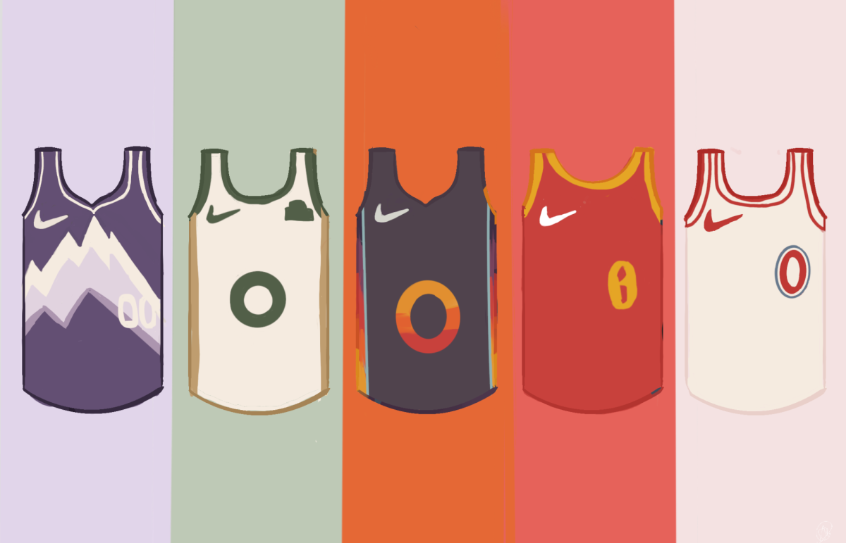
With every new NBA season that has had Nike as the sponsor, new jerseys are released that are meant to represent their city’s roots. This year is no different, as each team has unveiled their 2023-24 city edition jerseys which they will mix into their uniform rotation. Some are good, some are bad, and I’ll be ranking the best 5 out of the group.
- Boston Celtics
The Boston Celtics recently unveiled their 2024 city jerseys, which reveals a brand new look to their otherwise bland jersey history. This jersey stands out for many reasons.
The wordmark “Boston” in dark green and outlined in beige, is placed in the center of the white jersey, with dark green neck and shoulder stripes. There is a clean and classic number font that is bold without being flashy. The side stripes are the main reason I listed this jersey so high, as it has a long wooden graphic that stretches past the shorts.
This jersey, although a downgrade from last season, stands at number 5 due to the lack of well designed jerseys this season.
Score 7/10
- Cleveland Cavaliers
Although this jersey, when revealed by the organization initially, was shut down by fans at the arena for the presentation, it has grown on Cleveland fans due to November 2nd’s photo release, showing off the jersey on the players.
The jersey comes with a consistent red color scheme with fashionable golden stripes. The wordmark on this jersey presents us “The Land” in a slanted golden font. The numbers sit below, towards the middle right.
The main appeal of this jersey has to be the neck and shoulder stripes, which feature a golden baroque and ornate detailed trim.
The jersey is a partnership with Playhouse Square, a theater located in downtown Cleveland.
Score 7/10
- Houston Rockets
The Houston Rockets just recently revealed their 2024 city edition jerseys. These jerseys come with a clean and fresh look that represents their new squad. The jersey has a white base with red, white, and blue trims along the neck and shoulders.
Across the middle is their wordmark, “H-Town,” which is not new to their organization, as they have used it multiple times on city edition jerseys before. This time, it is modified in an italic font that features a red and blue color scheme. The numbers copy those same colors, with a more blocky font.
Overall, this jersey is very simple, which when done well, can work.
Score 8/10
- Phoenix Suns
Alongside every other team in the association, The Phoenix Suns have revealed a new option for their team’s jerseys.
This jersey features a deep purple backdrop with side stripes made to represent an Arizona sunset, a feature they have included in multiple jerseys in their recent history. The neck and shoulder stripes feature an orange and purple colorway that sticks out but isn’t too flashy.
Across the middle has a white and stylized “El Valle” meaning the Valley in english. The spanish on the jersey is meant to pay tribute to Phoenix’s large Mexican-American community.
Score 8/10
- Utah Jazz
Number one was an easy choice, with Utah standing way above the rest of its competitors. It could be surprising to some, mostly because of their lackluster home and away jerseys. But as shown, this jersey is a throwback to an all-time classic jersey from their John Stockton and Karl Malone era.
This jersey’s dominant feature is the mountain peaks that run across the top of the jersey. The wordmark “Utah” is proudly blazed across these peaks in a mix of purple and black. As it goes from the left to the right, the letters gradually decrease in size, giving a sense of movement that resonates with the team.
The number sits below and to the right in a simple white font that doesn’t detract from the rest of the jersey.
Score 9/10
